

Case studies
The work, and what it did.
A coffee shop, a Mexican restaurant, a shea butter line, a soap maker, a fashion house. Different products, one method: find what makes the experience worth having, then make people feel it on screen. It’s the same method we bring to every restaurant we partner with.

Featured — BOUTIQUE COFFEE
Dante’s Lattes
A Wednesday, Friday and Saturday content system that gave a new coffee shop something worth watching every week.
87Kviews, 1K new followers and 10K engagements on the Friday series
More of the work
From the brunch table to product, beauty and fashion.


Your restaurant, next.

Three posts a week, each with one job.
87K views, 1K new followers and 10K engagements on the Friday series
What changed.
Dante’s is now seen as a premium social hub, not just a place for caffeine: a new home for the neighborhood to meet. Sensory Noir became its highest-converting content, turning first-time viewers into regulars. A fully automated 52-asset content cycle keeps the feed consistent, and customer growth has run three times ahead of inventory projections.

The brief
Dante’s Lattes opened in a crowded local market with a world-class product and needed to land straight away. The job was to move past the “neighborhood café” label and show a premium, high-energy destination that matches the care in every cup.

What we made
We built Dante’s a weekly rhythm so the café wasn’t just seen, but felt: three posts, each with one job, repeated until the feed told one story. Alongside it, three short films of the craft, the room and the food.

One week, three jobs.
WEDNESDAY
The Craft of the Cup
Recipe cards on the bean, the measure and the barista’s hand, so the premium price makes sense before the first sip.
FRIDAY
Sensory Noir
Slow-motion films shot in 4K at 120fps: the pour, the texture and the ritual of the cup, made to stop a thumb mid-scroll.
87K views, 1K new followers and 10K engagements on the Friday series
SATURDAY
The Hospitality Concierge
The quiet ritual before the rush, before the doors open. Precision, cleanliness and care, so people trust the place before they walk in.
Three films, one café.
The craft behind the cup, the room on a full night and the food, each cut for the feed. Watch them as they land on a phone, on the Restaurants page.


Want this for your restaurant?
Dante’s is a café. The same weekly rhythm works for any room with a menu and a crowd worth showing.
From nightlife energy to a refined brunch experience.
52 creative assets: 10 cinematic reels, 40 original images and 2 hero films
Project status: in progress
A new identity needed a new visual language.
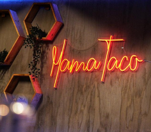
Mama Taco was evolving. Previously positioned around a nightlife and nightclub atmosphere, the restaurant wanted to establish itself as a more sophisticated, brunch-focused destination, but its existing visual presence didn’t fully communicate that direction. The brand needed to move away from nightlife-driven imagery toward content that felt elevated, inviting and experience-led, and to replace generic, Google-sourced menu imagery with authentic photography of its actual food. The challenge wasn’t simply creating better content. It was changing how people perceived the restaurant before they ever walked through the door.
Make the new experience impossible to miss.
Just GO’s creative approach repositions Mama Taco through cinematic storytelling, authentic food photography and a cohesive social media identity.
01
Redefine the atmosphere
Shift the visual narrative from nightlife to an elevated brunch experience: inviting ambiance, thoughtful details, food presentation and the moments that make dining at Mama Taco feel like an occasion.
02
Make the content cinematic
Short-form reels and hero films with intentional lighting, composition, movement and editing, giving Mama Taco a recognizable visual style that feels polished and consistent across social media.
03
Show the real food
Natural, professionally captured photographs of Mama Taco’s actual dishes in place of generic menu imagery, so customers know what to expect and the menu is more visually compelling.
04
Build a consistent brand presence
A versatile library of photography and video that Mama Taco can use across social media, digital menus and future marketing campaigns.
One creative direction. Multiple ways to experience it.
Ten cinematic reels highlighting the food, atmosphere and dining experience; 40 original images for menu presentation, social media and brand storytelling; and two hero films, signature cinematic pieces that communicate Mama Taco’s evolving identity. 52 creative assets in total.
The creative is ready. The results are next.
The content production phase is complete, and Mama Taco’s visual repositioning is underway. Next we evaluate campaign performance (reach, engagement, audience growth and content interactions) to understand how the new creative direction is resonating with its audience. Performance review: November 2026. Verified analytics and campaign results will be added after that reporting period.
Want this for your restaurant?
If your restaurant has changed and its pictures haven’t, this is where we start.
Visuals that made a premium price feel obvious.
+25% premium price increase, supported by the new visuals
What changed.
The new visuals supported a 25% premium price increase across the core product line, lifting margin without a proportional loss of sales volume. Organic shares and engagement rose significantly, and the audience now reads the brand as high-end, aspirational self-care. The new portfolio also won display space in several exclusive, high-end retail boutiques.

The brief
A founder-led whipped shea butter brand had outgrown its local look and was ready to charge a premium. The product was better than its pictures: clean but flat photos left it next to more polished competitors and kept pushing it into discounts. The goal was a visual identity of high-end ingredients, artisanal care and a self-care ritual worth paying more for.

What we made
A full visual overhaul built around purity and ritual: diffused studio light, high-contrast styling, and the jar set against soft silk, polished brass and whole shea nuts. We delivered a bank of 30+ product and lifestyle images, focused on texture and light, for website headers and email marketing, each one made to take price resistance off the table.
Want this for your restaurant?
A menu has its own textures and rituals. Shot with the same care, they make a higher price feel earned before anyone orders.
From farmers market to national retailer.
3.4% e-commerce conversion, up from 0.8%: more than four times the old rate
What changed.
E-commerce conversion rose from 0.8% to 3.4%, more than four times the old rate, within the first 90 days. The sensory video spot reached a 25% lower cost per acquisition than previous content, so the brand could scale ad spend profitably. With a portfolio of premium visuals, it pitched and secured its first distribution deal with a major national online retailer.

The brief
A founder-led artisanal soap brand moving from local markets to a national e-commerce platform and retail. Flat photos on white backgrounds hid the premium ingredients and the handwork. The cost was a 0.8% conversion rate on the online store, ads converting under 1%, high bounce rates on product pages and constant requests for discounts.

What we made
A visual theme built on source, scent and sensation: natural, dramatic light, high-contrast color, the rose soap set against deep textures, and honeycomb and raw oats as props. We delivered a suite of 25 product and lifestyle images for product pages, email and social, and a 30-second sensory video spot for paid ads, all macro texture and slow-motion water.
Want this for your restaurant?
Light and texture sold a bar of soap online. On a plate or in a glass, they do the same job for a menu.
Editorial-grade campaigns that turn clientele into loyalists.

What changed.
The campaigns deepened engagement with existing clientele and sharpened the brand’s editorial identity across every channel. It’s a visual world worth returning to: repeat clients now look forward to each seasonal drop.

What we made
A boutique fur and fashion house with a bold point of view and a style-driven clientele. Its garments deserved editorial imagery, but inconsistent visuals undersold the craft and blended the brand into a crowded fashion feed. We built seasonal campaigns around character, styling and location, from gallery interiors to cobblestone streets at dusk, treating every drop like a runway moment: lookbook photography and short campaign films for social rollout and in-store display.

Want this for your restaurant?
A room and its regulars can be styled like a campaign: a story people want to follow, season after season.
Sensory lifestyle campaigns with editorial polish.

What changed.
A signature look the audience recognizes instantly, no logo required. The concept-driven campaign content consistently outperforms the brand’s previous imagery in reach and saves.

What we made
A lifestyle and beauty brand built on personality, color and confidence, whose energy wasn’t translating on camera: the imagery read as generic content, not a world of its own. We gave it one, with high-concept sets and saturated color that make the brand recognizable mid-scroll. Concept-first shoots, from candy-land sets to rain-kissed street portraits and studio editorials, delivered as campaign photography and short-form video sequenced for launches and always-on social.

Want this for your restaurant?
A signature look is what makes a feed recognizable mid-scroll. A restaurant can own one too.